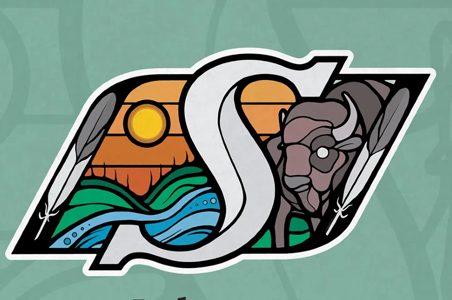
Artist Chris Chipak of the Red Pheasant Cree Nation has designed a new Saskatchewan Roughriders Indigenous logo which was revealed Saturday for Indigenous Peoples Day.
Chipak added new colours for the 2025 season to the original all-green version of the logo, announced in September 2024, that was also designed by Chipak.
Read more:
- Super Mario: Alford’s 99-yard kick return gives Riders a win in Toronto
- Find the latest Saskatchewan Roughriders news here
- The Blitz podcast with Jamie Nye and Britton Gray
The Riders said in a news release on June 21 that the refreshed logo highlights the connection to the land, people, and traditions of Saskatchewan’s Indigenous communities.
The logo was inspired by the Treaty 4 flag to incorporate the buffalo, which embodies the spirit of the Saskatchewan Prairies and represents the respect for the willingness to offer every part of itself to sustain the lives of others.
The Sun emphasizes the Treaty promise and it signifies the interconnectedness of all things to represent the collective effort that is essential to reconciliation, while the ribbon-like skyline pays tribute to the province’s identity as “the land of the living skies” and traditional ribbon skirts.
The river’s (kisiskâciwan) eight circles symbolize the number of native berries of Saskatchewan and the two upright feathers evoke a sense of respect and honour, while representing Two-Spirited people, acknowledging their roles as guides and their diverse perspectives within the community.
Feathers are a powerful symbol of the highest form of respect and the importance of inclusivity.

Saskatchewan Roughriders Indigenous logo was designed by Saskatoon artist Chris Chipack. (Saskatchewan Roughriders/Submitted)
Chipak says the new colours all hold great cultural significance.
- Green (grass), blue (river) and yellow (Sun) represents the Treaty promise “as long as the sun shines, the grass grows, and the rivers flow.”
- Brown (buffalo) draw connections to the land and the relationship the buffalo shared with it when they roamed the Prairies.
- Grey (feather tip) is a mix of light and dark that symbolizes the past, acknowledging the historical injustices within Canada and the future, working together toward Truth and Reconciliation
- Orange (the sky) holds several meanings including “land of the living sky.
Orange is also bright, bold and hard to ignore, like the truths that have come to light about the residential school system and its impact on Indigenous communities, and considered the colour of healing through Truth and Reconciliation. The different shades of orange represent how people all heal differently.
Orange is also inspired by the colour of the prairie lily, delicate but strong and resilient in the face of harsh Prairie conditions that grow naturally in clusters throughout the province, providing the hope to mirror its growth in the movement of Truth and Reconciliation.
Merchandise with the new logo will be sold at The Rider Store and at theriderstore.ca this Saturday at 10 a.m. The club said a portion of the proceeds will go toward supporting Indigenous initiatives across the province.
The new logo will be featured on Riders helmets for the kisiskâciwan game on June 28 against B.C Lions at Mosaic Stadium.
The kisiskâciwan game Party in the Park will feature cultural experiences, with First Nations University hosting a traditional tipi and educational booth, and the Newo-Yotina Friendship Centre offering hands-on language and dance instruction.
Read more:


